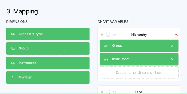
The mapping phase is the most important phase of creating a visualization in RAWGraphs. In this step you will map the data to the visual variables of the selected chart. The interaction is quite simple. You just have to drag the green rectangles, aka your data dimensions, and drop them inside the box under the name of the variables.
Here is an explanation of the graphical elements that you can see in the chart variables.
The grey icons on the left define which data types are accepted by that visual variable. In this case the variable "Hierarchy" accepts all the data types and it's mandatory. If there is a red * on the right it means that the variable is mandatory and the chart can't be created without that variable..

If the variable doesn't accept the data type of the dimension you dropped, the rectangle become red and the chart can't be created.
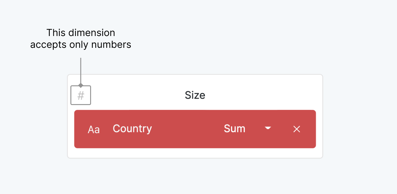
Some variables, like “Hierarchy” accept more than one dimension while others, like “Size”, accept only one variable. The order you place the dimensions in the variable that accepts more than one, is important. You can drag them inside to change the order.
RAWGraphs is not meant for data analysis, but simple aggregation operations can be applied. These aggregations are possible only for the variables “Size”, “Color” and “Labels”. When you drop a dimension in these variables a small dropdown will appear with a list of possible aggregations.

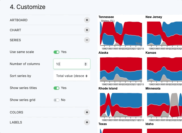
A small multiple (sometimes called trellis chart, lattice chart, grid chart, or panel chart) is a series of similar graphs or charts using the same scale and axes, allowing them to be easily compared. It uses multiple views to show different partitions of a dataset. The term was popularized by Edward Tufte (source).
In RAWGraphs for some charts (Bar chart, Multiset bar chart, Stacked bar chart, Beeswarm plot, Bump chart, Line chart, Streamgraph) you will find a variable called “Series”. The variable “Series” allows you to create a chart for each value of the dimension. The charts are organized in a grid as you can see in the visualization below, where we have a bump chart for each USA State.

In the option panel "Series" you can control all the graphical options related to the series (scale, grid size, sorting, titles and grid).
Color is a key element in data visualization and it can used for different purposes. According to the data type of the dimension dropped in “Color” different options become available.
If you map a string or a date to “Color”, in the customization panel you can change the colors used in the Ordinal color scale by selecting a predefined color scheme and then edit the single colors in the list through a color picker.
Ordinal color scales are used to symbolize data having no inherent order (i.e. categorical data).
If a number is used in “Color”, in the customization panel you will be able to change the color scale from “ordinal” to “sequential” or “diverging”.
Sequential color scales are usually used to highlight ordered data on a continuous scale and you can define the starting and the ending point of the color scale. By the default in RAWGraphs the start value is the minimum value of the dimension and the end is the maximum value.
Divergent color scales apply to ordered data as well. However, there is a central value about which all values are compared that by default in RAWGraphs is the average value.

By clicking on the first icon you can restore the default values while the second icon is to invert start and end colors. The lock icon is to “lock” the color scales on the values you see at that moment. In this way if you update your data, the start and end color will be the same and won’t be remapped to the minimum and maximum value of the new dataset.